“This building offers tremendous choice for movement except if you are in a wheelchair.”
–Ron Wickman
EDMONTON'S FINEST BUILDING?
HUB Mall in Edmonton has always held a special place in my heart. But as I have continued in my practice of accessible architecture, I see serious problems with the space, which was never intended to be accessible when it was first built. The interior has an appealing stacked density in its functions with classrooms, a circuit of shops and coffee shops with student dormitories above under the same roof. All of the dorms’ windows face the interior of the multi-purpose mall space, providing light and interest.
However, since accessibility was never considered in its initial design, entrance to the facility for anyone in a wheelchair is neither logical nor intuitive. Inadequate signage and the changes made to facilitate accessibility make it necessary for someone to have a companion with them whenever they first choose to access the building.
The above image illustrates my favorite building in Edmonton—HUB Mall, located at the University of Alberta. The building has been featured prominently in important architectural publications in both North America and Europe.
Its pedestrian street containing shops, eateries, and other services one level above the ground make this a glorious animated space full of people and activities. Despite my fondness for the space, it mirrors some of the flaws in the way accessibility has been incorporated into the architecture as an afterthought, rather than as inherent to the design, like the incorporation of natural light, for instance. HUB Mall has multiple entrances and was originally designed without a formal main entrance. The entrance identified in the above image was added after the original build. Visitors need to move up a long flight of stairs to get to the plus15 elevated link between the Mall and the Fine Arts Building, located further south of the Mall.
Anyone who cannot use the stairs must find another route to get to the Mall’s pedestrian street. On the concrete structural post to the right is a small blue sign with a white wheelchair symbol and a directional arrow. Though this sign is clearly pointing individuals in wheelchairs to an accessible building entrance, there is no way for them to know this starts the path to HUB Mall’s pedestrian street.
The above image shows a second accessibility directional sign, similar to the first.
Only those individuals who are familiar with the Mall’s barrier free path of travel will know how to get to the upper level. Beside the sign is a concrete ramp that leads to one of the Fine Arts Building’s main floor entrances. For any building to be truly accessible, the inside core of the building must be clearly understandable. It must work.
The above image clearly illustrates the inherent difficulties in practicing accessible architecture in which accessibility is not an element in the initial design process.
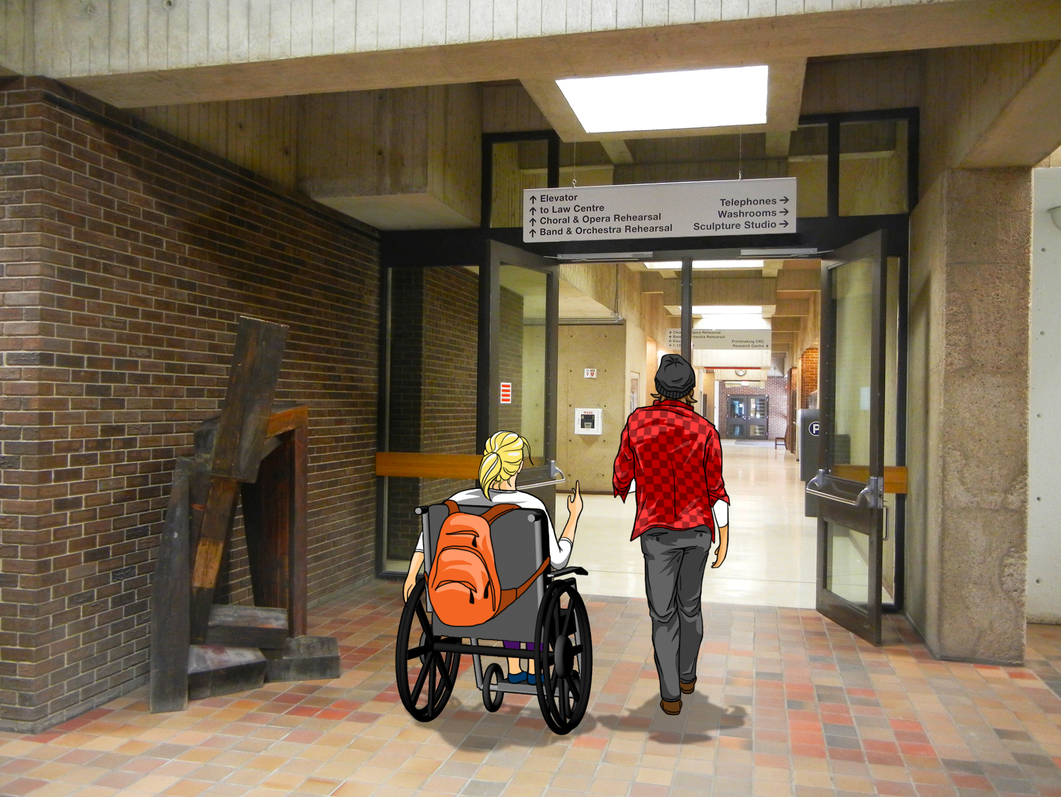
Once inside the Fine Arts Building, a directional sign above a set of double doors directs you to the elevator. For anyone with limited vision or travelling in a wheelchair, this signage would prove difficult to locate and read.
The above image shows the plus -15 pedestrian link.
If anyone can find the elevator and take it to the level of the elevated link, which leads all individuals to the pedestrian street, they will encounter this inside view of the elevated link.
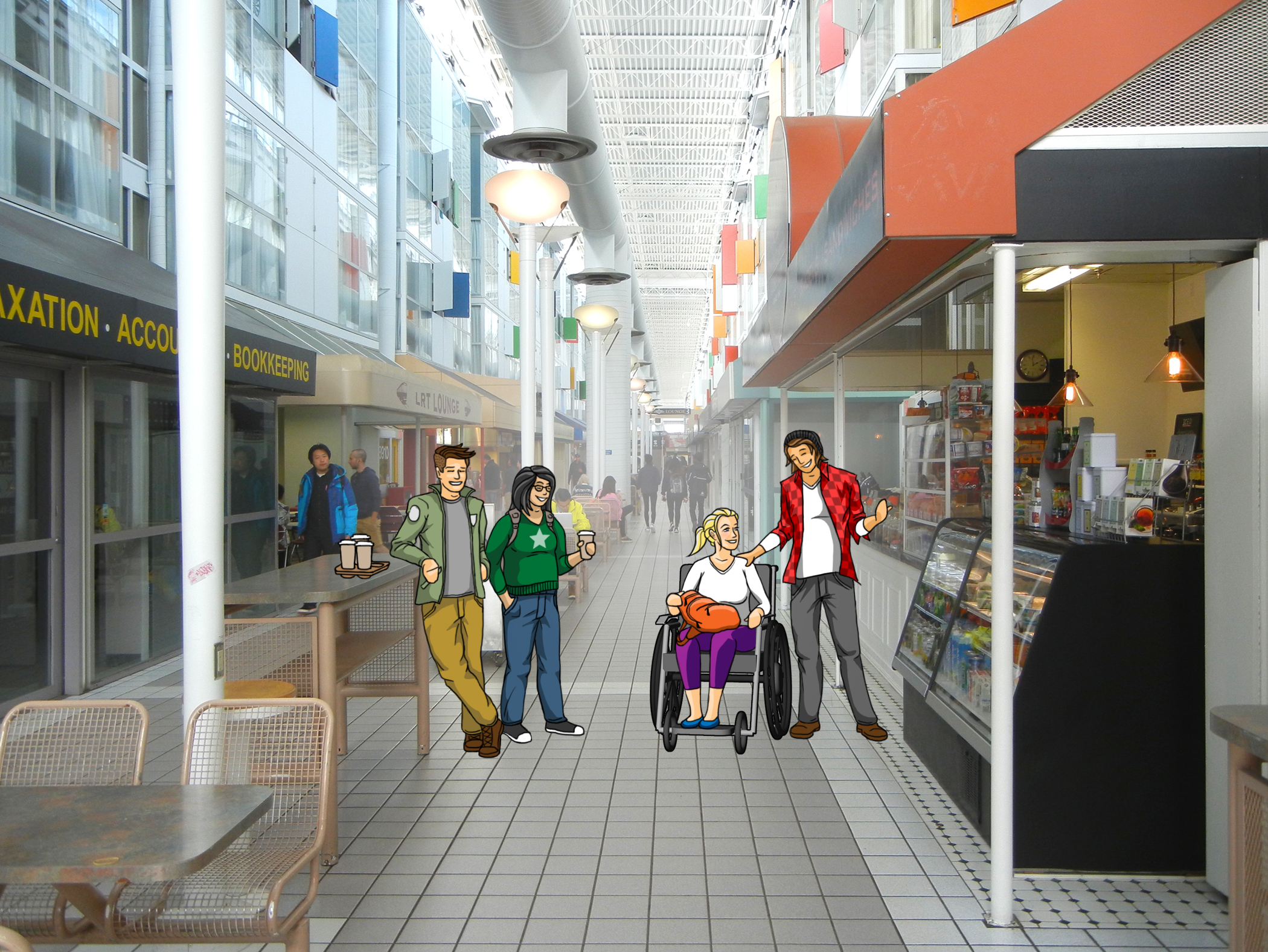
Finally, the above image illustrates the pleasures of HUB Mall’s pedestrian street.
The building is a beautiful example of building design with order, density, and complexity. Clearly, however, accessibility did not factor into the original design, and attempts have been made to create accessibility over the years, with limited success. An elevator located at the main entrance would seem to be the most practical solution.


