My House

“The home bridges affordability and ecological design and construction, while highlighting green-building materials and methods that are easy to obtain and simple to use.”

–Ron Wickman


MY REWARD!

house model.jpg

The above image is a scale model of our new family home viewed from the south. Like most architects, the design and re-design of our family home was de rigueur. In 2000, we completed a second-story addition to our 1960s bungalow. The home modifications were designed primarily to accommodate the growing needs of our family of five. Accessibility and sustainability were also important architectural concerns. The sustainable features include passive solar design; a well insulated building envelope, low-flow toilets, and a green roof. To make the home more accessible, all public spaces are clustered on the ground floor; we poured a sloping sidewalk at the front entrance. 

front drive view.jpg

The above image shows the front view of our new two-story home, facing east.

The home is located in a quiet late sixties south-side suburb along a beautiful street lined with elm trees. The existing 1400 SF bungalow doubled in size, with the renovated home providing more room for the family and for my home office. The addition to the home goes up rather than out. Located at the intersection of two back lanes, the home is sited on an east-west axis. Its south side faces one of the two lanes with better access to the sun. The home location is ideal with the added advantage of being located in a mature neighborhood close to a variety of amenities and public transportation. 

WICKMAN - MAIN.jpg

The above floor plan drawing illustrates the main floor of the home, wherein all the public spaces of the house are clustered, including my home office.

The office has a separate entrance at the front of the house, which can easily be blocked off from, or opened up to the rest of the living space, depending on the family’s needs. In the future, the space could be used as an in-law suite, or for an adult child still living at home. The crisp lines of this design are clearly inspired by the work of the early modernists with the house acting as a backdrop to human activities. A variety of box forms, devoid of any unnecessary embellishments, articulate the various functions of the building. Like later modernists, such as Alvar Aalto, the house utilizes a more human scale and warmer local building materials. Indeed, this house renovation looks to the past for inspiration, although it is more focused on today’s social and political conditions, and on our need to respect our fragile environment. 

WICKMAN- SECOND.jpg

The above floor plan illustrates the second floor of the home.

The design is straightforward with the house functions clearly divided into their constituent parts and the building’s form derived from the order of the interior and exterior spaces. A northern, two-story block contains the private spaces with four bedrooms on the second floor, and a home office, a sitting room, and a garage on the main floor. A south facing one-story block contains the public spaces on the main floor, topped off by a roof deck. A distinct third block, built at a height between the two other blocks, weaves the private and public realms together. This in-between space contains two levels of circulation complete with sitting areas, and serves to provide a positive connection between the public and private functions. Architects should spend more design time on these in-between spaces, since they are critical in imbuing meaning to the various functions in a single-family dwelling and in an entire city. Carefully constructed outdoor spaces also link the home to the rest of the community. The design of these outdoor rooms—the roof deck, front courtyard, and back play area—are every bit as important as the indoor spaces providing variety and personalization to this design. 

Staircase.jpg

The image of the stairs leading to the second floor utilizes color and textural contrast to help persons with low vision in their wayfinding. The stairs are finished in dark slate tile with light colored maple nosings. The high contrast makes it very easy for users to identify each individual stair. My design decisions—to be as accessible as possible— are based on maximizing the experiences of end users. There are no steps at the front door, allowing persons in wheelchairs to access the main floor independently. A residential elevator would be required to make the second floor wheelchair accessible. The home also bridges affordability and ecological design and construction, while highlighting green-building materials and methods that are easy to obtain and simple to use. 

 
Approach1.jpg

The image beside is a rendering by Jared Schmidts of my father moving up the sloping sidewalk to the front door of my house, from my adult children’s book Accessible Architecture: A Visit from Pops. “Buildings should never be designed simply as sculpted objects to be viewed; the design aims to be usable by as many people as possible. When architects design buildings that cannot accommodate people with disabilities and others, the strength of their design is compromised. Accessible architecture is not about limiting design options. It is about bringing value and meaning to design.” 

Affordable Housing Demonstration Project

“This concept is a winner. It has a simple yet livable design and makes innovative use of the site... Overall, this design sets a good precedent.”

–The Jury


OFFERING GREATER CHOICE IN HOUSING

AFFORDABLE HOUSING SITE.jpg

The above color-rendered site plan drawing highlights the landscaping and color contrast around and between buildings. The project houses an inner south-facing outdoor courtyard space measuring approximately 24’-0” by 24’-0” onto which each dwelling looks. Everyone is free to utilize this space, a move designed to promote social interaction, bringing people together rather than keeping them apart. Local architects and homebuilders were invited to design affordable, innovative housing for a city-owned lot at Baldwin at 12673 – 72 Street, allowing more flexible land use. At least one unit had to be suitable for families with children.

Eight local teams of architects, designers, and builders submitted proposals that included two or three units of housing on the site. The five-person jury considered each entry’s affordability, effective design, livability, neighbourhood fit, and innovation.

Winner of The Affordable Housing Demonstration Project in 1994, the tri-plex was the result of an open competition, initiated by the City of Edmonton Planning and Development and the Innovative Housing Committee. Its goal was to provide affordable and innovative duplex and triplex solutions for an inner city lot 35’-0” wide by 120’-0” long. Completed in the fall of 1995, it is still fully occupied.

1.jpg

The above drawing identifies the main floor plan complete with the ground floor of the two-story home and the ground floor accessible dwelling. The resident of the accessible dwelling can visit the other home from the back door facing the courtyard where there is a no-step entrance.

A simple flow-through circulation pattern is enabled with the absence of hall in the plan. Efficient use of space is notable in this design, as an outcome of lived experience. Designing to accommodate wheelchairs, which need more turnaround space, challenges architects to produce innovative solutions, which may be just outside the realm of what is considered the norm.

The project was designed to accomplish several important goals not usually addressed in Edmonton’s housing market. It had to accommodate low-income families, single parents, shared accommodations, seniors, and individuals with disabilities. Its flexibility allows one family to occupy both buildings, encouraging multi-generational housing: extended households, which include grandparents, young families with children or young adults living independently with disabilities. Alternatively, two families can each occupy a building, or three separate families can inhabit each unit.

2.jpg

The above drawing identifies the second floor plan of the two buildings. With limited circulation space within the units – the smaller unit is 24’-0”by 24’-0” or 576 sq. ft. and the two-story unit is 24’-0” by 32’-0” or 768 sq. ft. – allows for critical larger closet and storage space.

The integration of a courtyard into the design promotes social interaction rather than isolation. With an aging population and reduced institutional care for the elderly, the idea of an accessible granny suite like this project offers is timely.

adhp.jpg

The above image shows the integration of this housing project into its existing neighborhood.

It can be seen as an illustration of successful community infill, encouraging inner - city communities, which are often deserted as urban development continues in the suburbs. In my housing models, I try to provide for both privacy and socialization. The future of accessible design in the community is accessible community design: creating communities that are more accessible for everyone. This design fits into the existing streetscape, yet at the same time sets the tone for what future development could look like.

Features like on-grade access, open floor plans, a lower kitchen counter, lever door handles, grab bars, accordion closet doors, and adjustable rod and shelf heights all help a variety of individuals. The strategic uses of color and contrast plus changes in texture of ground and wall surfaces serve as visual and tactile cues for those persons with visual and cognitive limitations.

As architect Bjarke Ingels (Yes is More) wrote in a recent interview, “The task of a city is a practical one: to accommodate many people from all kinds of different backgrounds, age groups, social groups, economic capacities, genders, religions, and so on. It has to enable them to co-habit a limited amount of space successfully, in a way that maximizes the possibilities for each individual, without limiting the possibilities for all the others.”

This project designed with sustainability, adaptability, and flexibility makes it suitable housing for seniors and for people with disabilities. Their maximization of space, incorporation of light and proximity to the amenities typical of inner-city housing enables the residents to age in place, a growing concern among the number of seniors among us. Community, rather than isolation, is an essential ingredient of their continued vigor and mental health, despite their abilities.

The image above shows the street facing home complete with the address sign of high contrast white and black lettering.

The image above shows the street facing home complete with the address sign of high contrast white and black lettering.

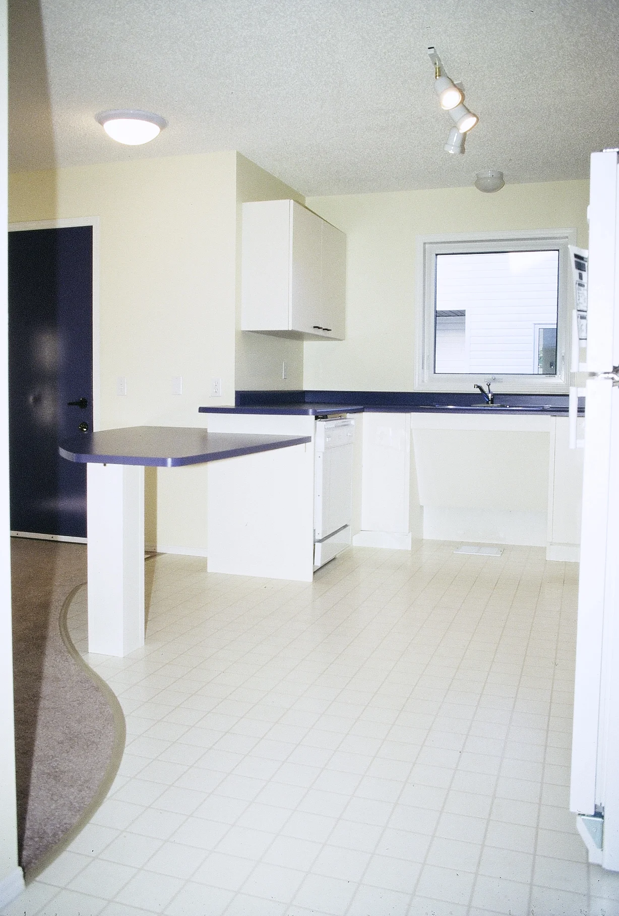
The image above shows the kitchen area of the ground level accessible dwelling. Most of the counter height is the standard 3’-0” from the floor. A lower counter, which is open underneath extends into the living space. The counter can serve as a work…

The image above shows the kitchen area of the ground level accessible dwelling. Most of the counter height is the standard 3’-0” from the floor. A lower counter, which is open underneath extends into the living space. The counter can serve as a workspace and eating area for someone sitting in a wheelchair. The sink is open underneath for easy wheelchair access.