The Premier’s Council on the Status of Persons with Disabilities

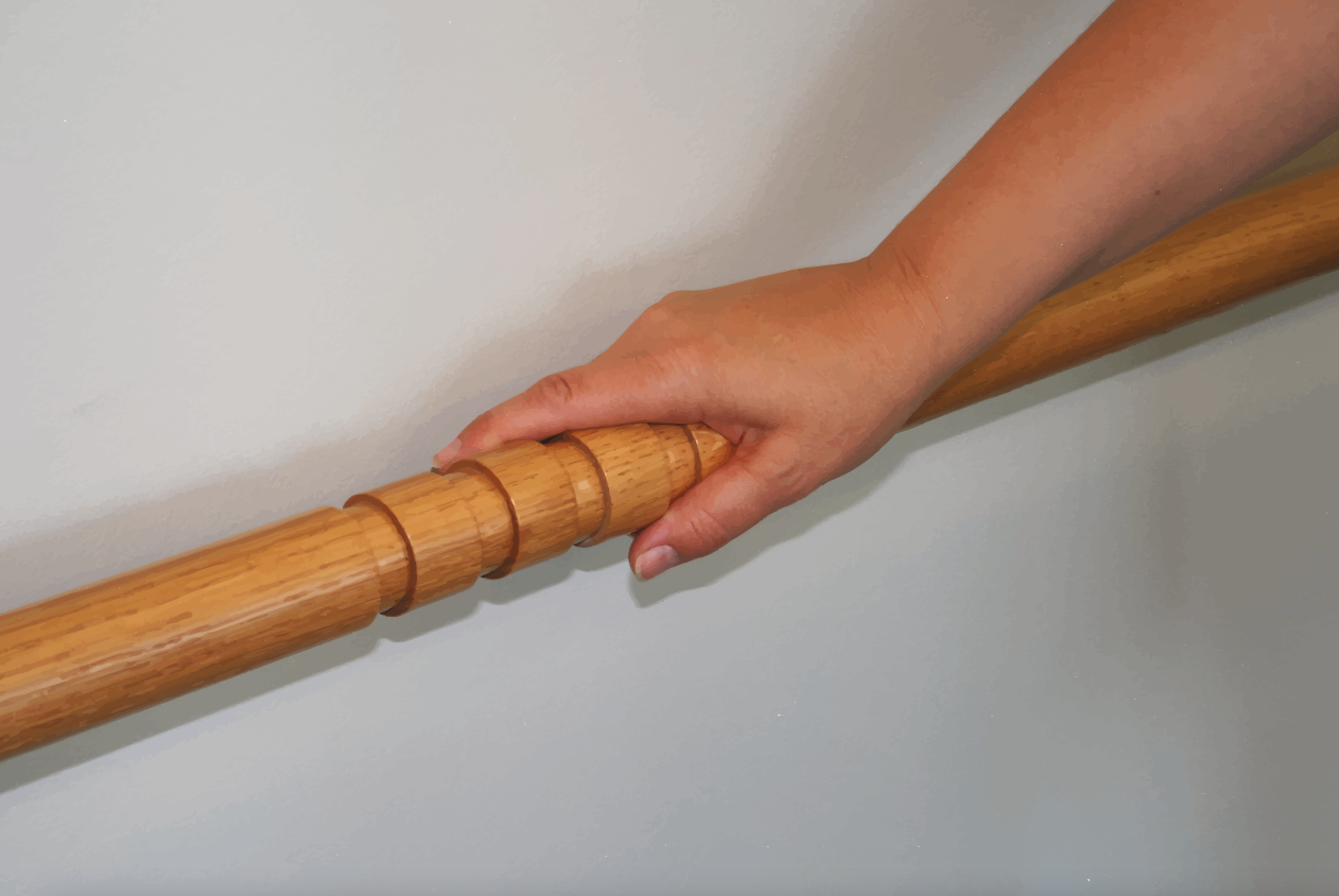
“Using this groove in the hand-rail as a directional device develops my confidence in wayfinding, even when I’m not accompanied by my dog.”

–Diane Bergeron, Accessible Design Expert. Diane Bergeron consulted extensively with Architect Ron Wickman when he was designing the space. Her input was invaluable.


AN ACCESSIBLE OFFICE SPACE

The architect’s essential task is to design paths and means of movement that are clearly organized and intuitively locatable. 

When I was asked to design the office space for the Premier’s Council on the Status of Persons with Disabilities in downtown Edmonton, this became my challenge. Details like the handrail had to be perfectly honed as a directional detail for staff and visitors entering the meeting rooms and offices of varying sizes, support spaces or accessible washroom, all designed to accommodate as many people as possible.

The four grooves cut into the circumference of the handrail, set at 900mm (3’-0”) above the floor along the entire privacy wall indicate the location of doorways to adjacent cubicles. The handrail detail is unique to this office space, making it necessary for users to know the purpose of the grooves as a directional device.

The above image is an interior view of the waiting area highlighted by the curving privacy wall.

As one enters the office space, the most immediate feature is the tremendous spaciousness. The waiting area is extensive, highlighted by a curving division wall. The wall undulates upwards from the most public to the most private spaces in the office. To the east, directly off the foyer, an accessible toilet room in a circular shape amplifies the spaciousness. Meeting rooms, offices, and cubicles are comfortably roomy; nonetheless, it is secondary to the spaciousness that surrounds them.

The elements of wayfinding design—that is how people orient themselves in a space—make the office space uniquely empowering for its users. One-and-a-half-meter-wide squares are cut into the existing carpet at points where the user would need to make a decision to change directions using squares made of Marmoleum, a greener, more sustainable variety of linoleum. The color and texture contrast serve as wayfinding cues and assist people with visual disabilities to make positive and purposeful choices in movement. For people who are blind, the squares allow them to move about without the use of a cane or a guide dog. The vocabulary provided by the color and texture of materials, by decorative elements of walls and ceilings and by light, sounds and smells, is almost infinite.

This image is a floor plan of the office space for the Premier’s Council on the Status of Persons with Disabilities, located on the eleventh floor of the HSBC Building in downtown Edmonton. The orange and yellow Marmoleum squares act as color and textural contrast indicators in directional wayfinding, indicating the need for the person to change direction.

The image beside shows Diane Bergeron and her guide dog standing outside a cubicle space utilizing another directional device carved into the wooden handrail. I was confident in the task, but my friend Diane Bergeron gave me great insight into the way persons with visual limitations orient themselves in space and move around it, including enhancing the maximization of echolocation. Thanks to her intelligent questions, the office space, designed to accommodate
staff members like her who are blind or use wheelchairs, functions well. 

In the world of design, many architects focus an inordinate amount of energy on the visual beauty of a detail. Completed with great effect it may indeed be very beautiful but its functionality matters not at all to the designer, his peers and the general public. An accessible design detail, however, must not only have beauty, it must also work functionally for all users. When an accessible design detail is completely wrong, it will indeed not only look dumb to everyone, it can also confuse users for whom it was intended.

An astute observer and a practical woman, Diane Bergeron was a tremendous asset to me while I worked on this project. She gave me great
insight into the way persons with visual limitations orient themselves in space and move around in it. She also often offered practical solutions to enhance echolocation as this capability is known. During design meetings, I had to be very detailed in my verbal descriptions about the office layout to convey my intentions, a practice which greatly benefitted everyone’s understanding of my design process and solutions.

The mandate given me was to design the new Premier’s Council space as the best example of good design possible, not simply focusing on good accessible design. This moves the focus away from just designing to accommodate persons with disabilities toward designing to accommodate everyone. Through the strategic placement of the functions, activities and elements that make up a building, and through the manipulation of space, light, color, texture and materials, architecture helps allow all users to make positive and purposeful choices for independent movement. It’s a given. Accessible Design then, is not just considering the individual pieces that make up the whole, but rather it is recognizing that the collection of pieces are all deeply interdependent.

The accessible toilet room that I designed is a focal feature in the overall design of the office space. Glass blocks allow for natural light to enter the washroom. The door’s kickplate is organically shaped, utilizing the same Marmoleum that is used in the flooring contrast pieces. Color contrast is also used inside the toilet room where the floor meets the wall. This allows people with low vision to identify the boundaries of the space. Ultimately, this space is a positive blend of function and beauty. What makes the space so beautiful is its functionality.

Architecture helps allow all users to make positive and purposeful choices for independent movement.

Ambrose Place

A HEALING HOME

In 2006, NiGiNan Housing Ventures, a not-for-profit group hired me to design a housing project for persons who are currently homeless. Ambrose Place primarily serves homeless individuals and couples of Aboriginal descent: chronic substance abusers who cannot be housed within existing facilities. Some may have been barred from existing facilities, while others may feel that the existing facilities do not meet their requirements and thus do not use them. Many of the individuals suffer from concurrent mental health issues such as dual addictions. The housing focuses upon improving the quality of the individual’s life, health, and well-being, looking beyond the labels of addictions or disability to look at the whole person including their history, culture, mental, physical, and spiritual needs. The role of the practitioner is to educate the person on options and consequences, thus enabling the individual to improve their quality of life, health, and wellbeing through gradual non-judgmental means. Ambrose Place meets these standards.

The architecture adheres to the principles of American sculptor Davis Best of Burning Man fame. “…it’s more important who goes inside…A building itself should never be more important than the people.” The beauty of this project is not just based on its visual aspects, but in its ability to transform people’s lives. There is tremendous beauty in living with grace, safety, and confidence.

The design of Ambrose Place provides an environment that facilitates individual growth and development and enhances the individual’s self-esteem and capacity for independent living. Residents need to have a sense of control over their own lives. The project transformed six raw, vacant lots on the south side of 106th Avenue between 96th and 97th Streets in downtown Edmonton. Through its enhancement of the built environment with social housing that enhances the quality of life of its residents, Ambrose Place reaps both social and economic benefits for the City of Edmonton. 

The above image shows Ambrose Place within its urban context. Both within Ambrose Place and the community where it is located, accessibility is a guiding principle. The building is strategically located in the inner city close to many important amenities, which comprise part of the individual residents’ daily lives. Easy access to health-care services - located only a half block to the east - a commercial shopping street - located only a block to the west contribute to the residents’ quality of life. The downtown police station, just north of Ambrose Place provides safety for all its residents. The building increases the density in the community by maximizing the building pocket size and allowable height at four storeys, a height which harmonizes with its surrounding community. It is designed at a scale to fit within its urban context. 

IMG_9094.jpg

The image beside shows an exterior view of Ambrose Place. The modulated roofline and walls with projecting bay windows provide depth and complexity to the building form. The four singular pieces of the building are different colors—red, white, blue, and yellow—making each piece more identifiable. The natural materials used are located close to where individuals can touch and smell. The landscape design incorporates the four elements of Earth, Fire, Water, and Medicine, elements central to the First Nations’ culture and intended to bring additional healing and relevance to its inhabitants. 

FrontEntrance.png

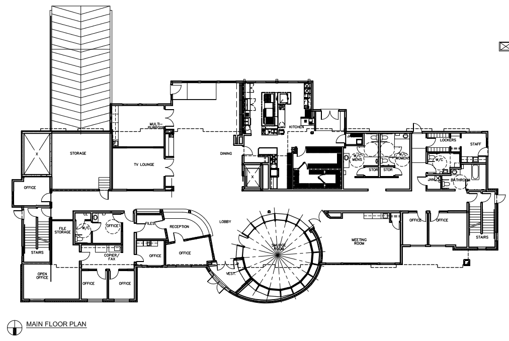
This is the main entrance. The new facility consists of four floors, plus an underground parking garage. The top floors contain 42 dwellings: 36 bachelor suites and 6 two-bedroom suites, The main floor consists of shared spaces that include dining room, exercise and tub room, TV and recreation areas, a Quiet Room, staff offices, staff laundry and more. A circular Smudging Hut located in the central lobby focuses as both a physical and spiritual reference point, inside and outside, for residents, staff, and visitors including the neighboring community. As the heart of the building, the Smudging Hut is central to the design concept and is the most decorated and detailed part of the building. 

AMBROSE MAIN.jpg

The above plan shows the main floor of Ambrose Place, which houses all the amenity services including the smudge room. 

AMBROSE 2,3,4.jpg

The above plan shows the second, third, and fourth floors of Ambrose Place which houses the 42 living units, all with their own kitchens and bathrooms. 

The above images show an exterior view of the Smudging Hut and Landscaping. 

The above images show an exterior view of the Smudging Hut and Landscaping. 

The above image shows an interior view of the Smudging Hut. 

The above image shows an interior view of the Smudging Hut. 

Screen Shot 2017-09-12 at 5.57.44 PM.png

The above image shows two views of the bathrooms at Ambrose Place. All 42 suites house bathrooms designed as wet rooms to allow for curbless wheelchair accessible showers. 

Screen Shot 2017-09-12 at 5.59.22 PM.png

The above image shows an interior view of an adaptable kitchen. At Ambrose Place, we designed 10 adjustable kitchens instead of the required five. We designed an L-shaped counter, which moves up and down to accommodate both residents in wheelchairs and those who have mobility; it is open underneath. For a resident in a wheelchair, he / she can slide a pot along the counter from the sink to the cooktop and back. The upper cabinets have also been constructed to move up and down. This has all been accomplished with nuts, bolts and screws. Extra building costs were minimal. 

Accessible features at Ambrose Place exceed the Barrier Free Design Requirements located in the Alberta Building Code include, simply put, wheelchair accessibility is addressed outside and inside all four levels of the building.. The Alberta Building Code requires five adaptable suites. The provision of these dwelling units needs further classification since it is difficult to anticipate individual needs. Ten suites house adaptable kitchens. Color and texture contrast is used to help all users in their wayfinding.

Persons who are blind or deaf require a common electric circuit interconnecting all rooms and with the potential for connection to the fire alarm, intrusion alarm, intercom and phone system. To ensure that Ambrose Place met these requirements, the design team met with potential residents to ensure that the design met his needs. 

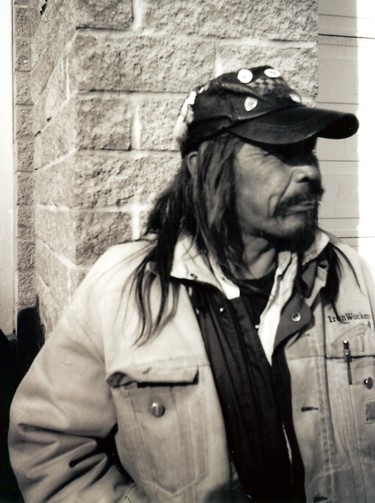
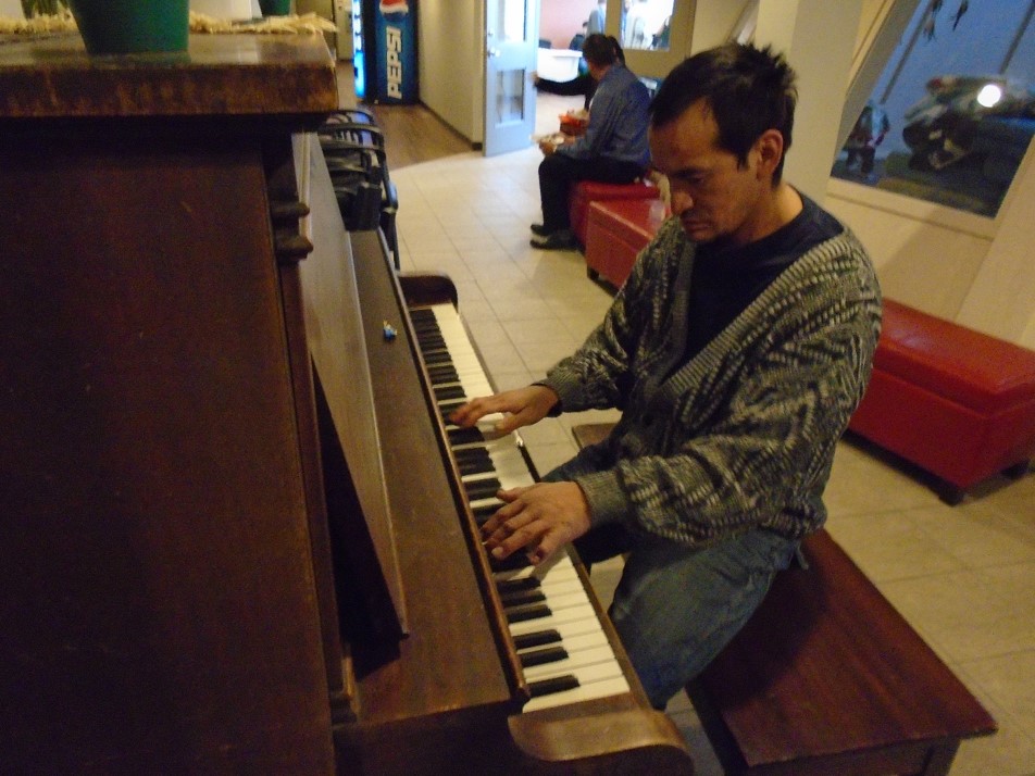
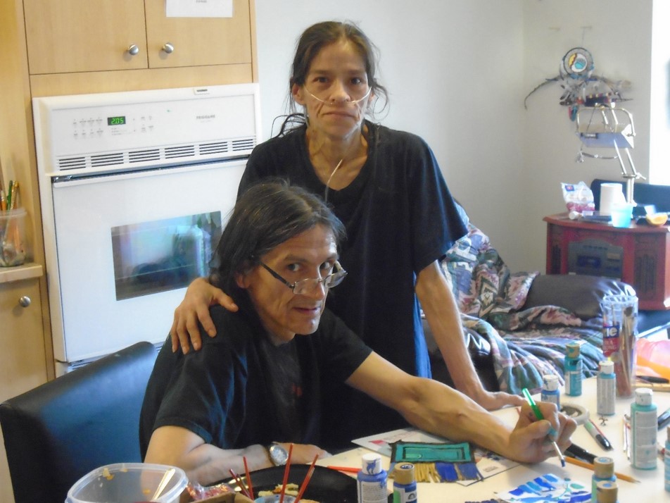
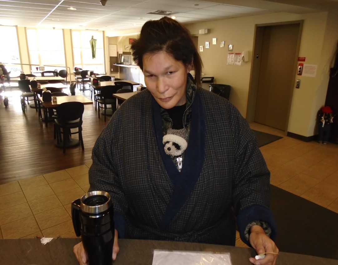
Ambrose Place has changed people’s lives. The four images above feature Ambrose, after whom the building has been named. He died on the streets living as a homeless person. Piano man Ryan was a YouTube sensation playing a piano in an outdoor public space in Edmonton. In the past, he had difficulty remaining in housing due to his addiction and mental health concerns. Ambrose Place has become home for him. Ronalda and Brad live as a couple at Ambrose Place. Ronalda has a chronic respiratory system; Brad has been diagnosed with a terminal disease and has use of only one leg. Homeless for a long time, they stayed in shelters, hotels, and with friends until 2014 when they moved to Ambrose Place. Brad had his first Art Show in February 2016. Valerie was diagnosed and given a life expectancy of two months, after being homeless for the last 20 years with couch surfing and shelters. At Ambrose Place since 2014, she is thriving. Ambrose Place has special meaning to myself, as my father came to Edmonton from Thunder Bay as a young man, and lived homeless for a short period of time. Finding a safe home meant everything to him.